
| Home The District Events OHDS Resources Archives |
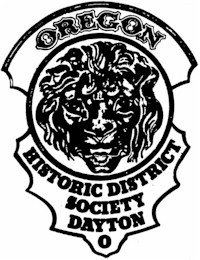
The OHDS Logo
Their work was usually identified by a cast iron lion's face in relief, bearing the inscription "McHose & Lyon, Manufacturers, Dayton, Ohio" under the lion's face. This emblem was used mainly on fence gates and, at times, the name of the homeowner for whom the gate was made appeared in a semi-arch panel over the top of the lion's face. Mr. William McHose, a 72 year resident of the area, lived for 45 years in a fine Victorian home located at 53 Green Street, which he built in 1873 as a wedding gift for his bride. Mr. McHose adopted the lion head emblem as a mark of his work shortly after he opened a small shop on the canal below Third Street. It originally bore his name, changing when Calvin Lyon became his partner in 1877. The Oregon Historic District Society felt this symbol was a unique Dayton Historical item and that it bore a most direct relation to this area. They decided to use as their logo the lion head in its original design, replacing the firm name with that of the Society. They retained the same style of letters used on the original with the exception of the name "Oregon". The letter styling of this word was taken from metal letters on an original leather fire horse harness of the old Oregon Volunteer Fire Company. This horse belt was borrowed from the private collection of James Davis for copying purposes. On the logo, "Oregon" was placed in the semi-arch panel position where the homeowner's name would have appeared on the original casting. |
© 2026, Oregon Historic District Society, Inc. All rights reserved.
Send comments to The OHDS Web Team
replica watches sale
 The logo of the Oregon Historic District Society is a modern adaptation of the lion
head emblem of the McHose and Lyon Dayton Architectural Iron Works, a local firm, in
business for approximately 30 years beginning in 1868. This firm supplied much
architectural ironwork for construction, not only in Dayton, but throughout the Midwest.
Their fences and iron lace verandahs are still much in evidence in the Oregon District and
elsewhere.